
Hola! Welcome to my stop on the Hero Arts Stamp Your Story blog hop! You should have arrived here via Michelle Wooderson’s blog — hi Mish! If you’re just joining us or you encounter a broken link you can head back to the start at Hero Arts.
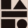
I’ve got four one layer cards to share with you today, all featuring one of my favorite sets in the Stamp Your Story collection: Stamp and Build. This set may not look like much at first glance. But oh, the possibilities. They are endless.

One little trick I wanted to share: if you plan to use a stamp positioner like I did, mark the side of the square and rectangle that goes against the positioner with a bit of washi tape. The edges aren’t perfectly even, so this will keep you from stamping it the wrong way like I did! Ooops! (Triangle tape preferred if you have it, ha!)
Now on to the cards! First I had to play with the triangle — because I’m really into triangles at the moment. Have been for a while now, as evidenced by my pinterest board. (Come back and check it out after the hop for lotsa ideas.) I wanted to make a card that would cure the summertime blues — ha! — so I used a whole lotta blues, including neon!

(Colors used: soft sky, soft granite, navy, cornflower, stone wash, neon blue, and silver.)
This was so easy to do! I just broke out my trusty stamp positioner, then stamped a bunch of rectangles in the background. Then I overstamped them with triangles. There’s something relaxing about using a stamp positioner and blue inks. (Either that, or maybe the heat is getting to me ha!! — it’s been HOT here in Austin, Texas!)

The message on the side reads “you’re the best…in the west”. Just love that! It’s from this Hero Arts/Studio Calico set. These are two separate stamps — I added the “…” with a black pen. :)
And I just had to use a silver metallic triangle on the neon blue square. Just because.

Next, that sentiment gave me the idea to make the card again, but using southwest colors. Something like you’d find in a hip boutique here — and pay like $25 for a set of 4 cards. :)

(Colors used: pale tomato, soft peach, wet cement, charcoal, soft sand, mint julep, neon orange, gold.)
But this time? This time I gave that mint julep rectangle a gold triangle.

Love how the Hero inks smooth into the paper and blend together. It’s almost like suede.
Next I decided I wanted to use the square stamp, and play with overlapping colors. So I came up with this:


(Colors used: butterbar, cornflower, mint julep, tide pool, fresh peach, pale tomato.)
You can really see how the inks overlap to form new colors on this one! Note I didn’t use any green or orange inks — those stripes you see were made just from the overlapping colors! And the sentiment is from this set.
And I still couldn’t stop until I used every last stamp in the set. As I was pondering what to do, I was thinking about how triangles look like mountains, and came up with this one. It reminds me of Mt. Fuji!
Hope to get back there someday when we can stay longer and hike the whole way to the top. :)


On this card, I used the kissing technique to give the skinny rectangles a little texture. It’s really easy to do — first I inked the skinny rectangle with soft sky and then I inked the envelope pattern stamp with navy. Then I kissed the skinny rectangle to the envelope pattern stamp and finally stamped it on my card front. So cool.
Then to get the little snow cap on top of Mt. Fuji I used my stamp positioner to stamp it twice. First I inked the triangle with cornflower and navy inks and stamped it. Then I cleaned it off and inked it with silver and stamped it again. Really love how this came out, so peaceful somehow.
Sure hope you liked my one layer cards! In case you haven’t heard, I issued a one layer card challenge over on the Hero Arts blog HERE! It runs now through July 15th — hope you can join in the fun! And if you need some more triangle inspiration, check out the CASE Study Challenge blog this week for two more cards from me (using different supplies, ha ha) and amazing cards from the DT! :)
Before you go, be sure to leave a comment — Hero is giving away a great prize pack with the winner chosen randomly from all the pool of comments left on all the blogs in the hop. The more comments you leave, the more chances you have to win. Woo!
Now then, on with the hop! Your next stop is the amazing Kristina Werner — I just can’t wait to see what she’s made! (I know it will be awesome — just like her.) Take it away, K!
Supplies:
                          |
Great cards thanks for sharing and thanks for a chance to win
Great cards! Some real cool techniques too. Thanks!
Love the look where the blocks overlap into a different color. Also love the Mt. Fuji one.
<3 J
Great designs. Love how much colour you used.
Such basic shapes used to make some beautiful cards.
Beautiful cards! The colors work so well together:-)
Great cards Lisa – I love that its easy to get creative and build both abstract designs and create mini scenes like you Mt Fuji! Rx
Love, love, love your cards! :)
I like the various shades of blue on the triangle card. Too cool!
I love your cards. Those stamps are great.
Great use of basic shapes.
I really like the kissing technique on your last card, the colors turned out beautiful.
Thanks for sharing; I have similar stamps and, of course, never thought to overlap colours to create “new” colours.
I just love these graphic shapes!
What wonderful colors! Each card was simple yet stunning. I especially like the way you overlapped the colors with the rectangle but stamped at an angle. Looks like I need to get out my stamp positioner and get busy. Thanks for the heads up on the challenge too!
Great graphic effect!!
Very creative with some basic stamps – guess that’s why you are a STAR!
Oh, Lisa, these cards are so stunning! Your color combos are wonderful! Great use of pattern. Love them!
Lisa,
Your very simple and very graphic cards are so much fun. I can tell you had a great time making them!!
Love the overlapping squares.