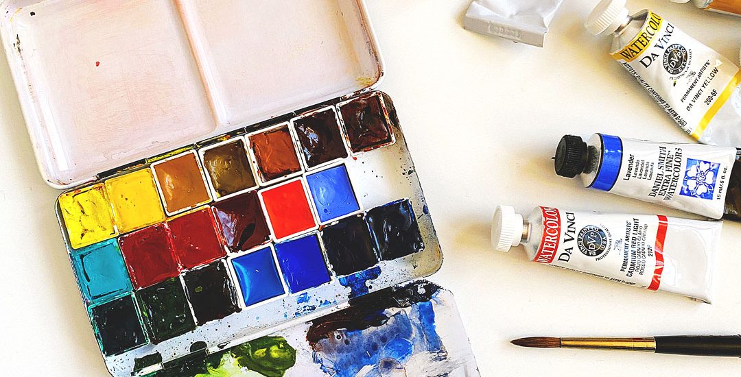
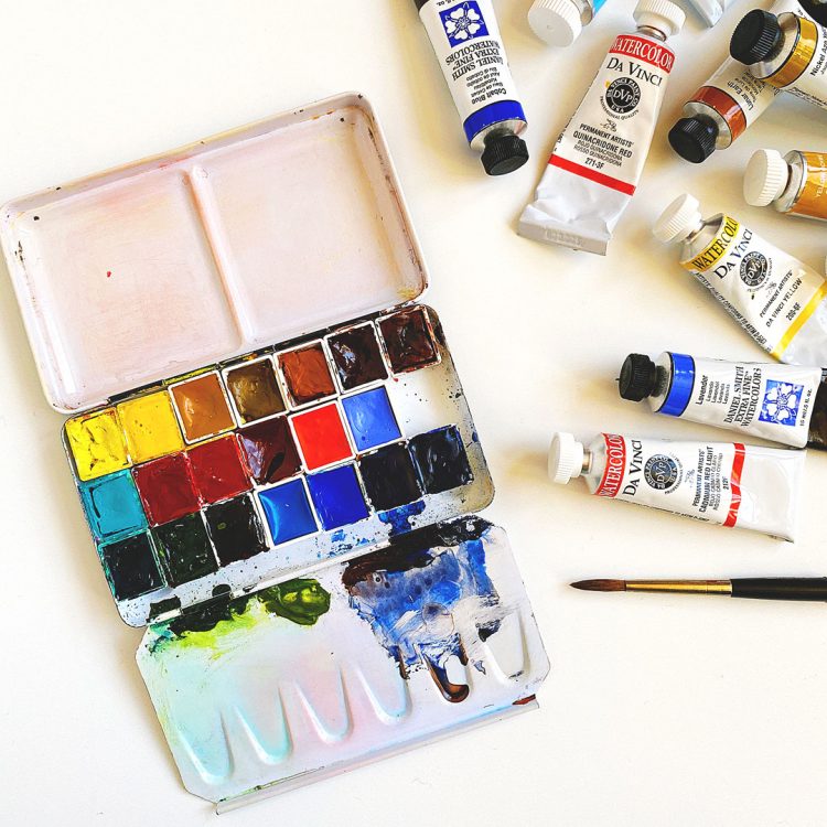
One of the things I love to do at the start of a new year is to update my palette. I refill pans, give it a good scrub, and try out new colors! Here’s my last update in case you’d like to see what I had in there before. I always find it helpful to see what other artists use — so I thought I’d document mine in case it helps someone out there!
As you can tell, I like to leave the area where I mix skies over in the lower right alone. This is where I mix ultramarine blue with transparent red oxide — and as you can see I have some blobs of paint there to make it super easy to mix them.
Here are the colors in order — I’ll walk you through them below:
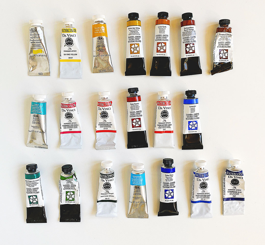
Abbreviations for manufacturers:
- WN = Winsor & Newton Professional – I started out with WN but have been gradually moving to DS as a color runs out as I find DS colors rewet easier, although there are some colors that I still prefer in WN! Maybe that old saying about what you use first becomes your favorite? :)
- DS – Daniel Smith – what many consider to be the gold standard.
- DV = DaVinci — I started using these in 2018 and love how they handle here in my Texas climate. They rewet really well!
I listed the pigment numbers in addition to the names as sometimes manufacturers call the same paint by a different name. Consult handprint.com for more — this is such a good source of info. I’ve added links to handprint when possible.
Top row:
- WN Bismuth yellow (PY184) — a semi-opaque cool yellow. One of my favorite things to do with it is load up a brush really well with paint and put it in a wet wash.
- DV DaVinci yellow (PY154), sometimes called azo yellow — I used to have Hansa Yellow Medium in this spot but I tried DV yellow in a sampler pack and really like how it handles; it seems like a “true” and has a very small drying shift.
- WN Yellow ochre (PY43) — I love using this color to warm up skies — it adds a warm glow and won’t turn green if a blue happens to touch it. The WN version just seems to glow — others I’ve tried don’t compare.
- DS Nickel Azo yellow (PY150) — a bright, clear yellow that DS considers an “earth” yellow; if you go to purchase a tube it won’t be with the other yellows in the display — I found it towards the bottom with the siennas. It’s has a greenish tinge in mass. This is a new one for me! I started using it because so many artists use quinacridone gold and I wanted to see what all the fuss was about. DS’s quin gold is a mixture of nickel azo yellow and quinacridone burnt sienna, which I had already planned on adding to my palette. So I decided to add this instead of quin gold so that I could use this pigment as well. Will see how it goes!
- DS Lunar earth (PBr11) — I first heard about this color from Maria at Expeditionary Art and when I saw that granulation I had to try it!
- DS Quinacridone burnt orange (PO48) — some artists use this instead of transparent red oxide, so I wanted to compare the two.
- DS Transparent red oxide (PR101) — I’ve been using this for a while now and love how it moves wet in wet!
Second row:
- WN Cobalt turquoise light (PG50) — this is one of the very first colors I picked up when I first got into watercolor and although it can be hard to rewet if I haven’t used it for a while, I haven’t found another brand of PG50 that works as well as this one. It’s just lovely. I use it to mix colors for cacti, yucca and agaves.
- DV Permanent rose (PV19) — DaVinci’s version of DS’s quinacridone rose. It’s a little less blue DS’s, but I’ve found this one works better in our climate.
- DV Quinacridone red (PR209) — when I was first learning about watercolors I didn’t know to look at pigment numbers and I ended up purchasing this color from three different manufacturers lol! This is DS quinacridone coral. I started purchasing it from DV because at the time it was only available in the smaller 5ml tube from DS; it’s now available in larger sizes. I mostly use this color for wildflowers, but it’s great for skies and rocks as well. It’s a beautiful warm red.
- DS Deep scarlet (PR175) — another color that I learned about from Maria and I can’t wait to paint with it more.
- DV Cadmium red light (PR108) — I tried to stay away from cadmiums but watching Roland Lee paint with it made me want to give it a try.
- DS Lavender (titanium white PW6 + ultramarine violet PV15 + ultramarine blue PB29) — I saw this in Uma Kelkar’s palette from Expeditionary Art and got curious about it. I’m not usually one for mixes but I like that it has white in it. We’ll see if this color stays in the palette or not. One thing I want to remember to play with is to mix it with yellows.
Third row:
- DS Phthalo green (blue shade) (PG7) — such a powerful green! It was hard for me to use when I first got started but now I find it’s a must-have.
- DS Sap green (quinacridone burnt orange PO48 + nickel azo yellow PY150 + phthalo green PG7) — this is a convenient “home base” green for when I’m painting in a hurry; it’s easy to modify it by adding a touch of a blue or red.
- DV Perylene green (PBk31) — a deep green; the pigment is actually in the black category. Great for dark shadows, mixing with cobalt teal light for cacti/yuccas and more.
- WN Manganese blue hue (PB15:3) — this is beautiful clear winter sky blue; I usually take it out come spring and add indanthrone blue.
- DS Cobalt blue (PB28) — many artists refer to this as a “true” blue; another one that’s great for winter skies. I find it to be weaker than ultramarine and am currently comparing the two. Cobalt is my spirit color — there’s a long story behind that — the short story is that after 6 leg surgeries for a torn ACL I found out that I’m allergic to cobalt! It’s in stainless steel and it turns out that I had to have the “hardware” taken out!
- DV Phthalo blue (red shade) (PB15) — great for summer skies and for mixing with quin rose for a burgundy purple.
- DV Ultramarine blue (PB29) — a lovely granulating warm blue; this blue has been my palette for a long time. Makes the best purple mixed with quin rose and I mix it with transparent red oxide for grays/browns.
Sharp-eyed readers may have noticed that there’s an opening for one more color in my palette. Right now I’m kicking around a white (Chinese white (PW4) or titanium (PW6)), mars black (PBk11), carbazole violet (PV23) or I might bring back Naples yellow. I’d love to hear what you think I need to fill that void! I’ll update this post when/if I ever decide. :)
Hope this helps someone out there!
Thanks for all the great info about the various brands you like. I have some Winsor & Newton, some DaVinci from years back and some American Journey from a trip to the NC mountains ( a favorite place) and to Boone, NC where Cheap Joe’s is located. Lol! My husband was a good sport about that side trip and sat on the porch and enjoyed the view while I looked at everything in the shop. I wish I had been more knowledgeable about paints at the time. I’m thinking I should add some Daniel Smith(maybe the sap green and the deep scarlet)) to my collection. As for your question, I would add the cabazole violet or the naples yellow to the palette( as if I knew anything about it). ……lol!
Ahhh I’d love to visit Cheap Joe’s someday! Your husband sounds like a good guy!! And this is funny but I was kind of thinking cabazole violet — maybe I should go with it! I had Naples yellow on my palette before but found I didn’t use it much — I always reached for yellow ochre instead…but maybe I’ll miss it! Thanks, Barbara!!!
Thanks for your awesome blog post about your color palette, excited to see your experiments with these colors! I LOVE having carbazole violet in my palette, and though I am a beginner at playing with water color, I use this violet more than I thought…. it’s a little granulating, vibrant, almost black to light violet. When I don’t know WHAT to do when I’m not satisfied with a color on the paper, I try adding a bit of carbazole violet, lol.
Thank you! It’s sounding more and more like I need to add carbazole violet in that spot! :)