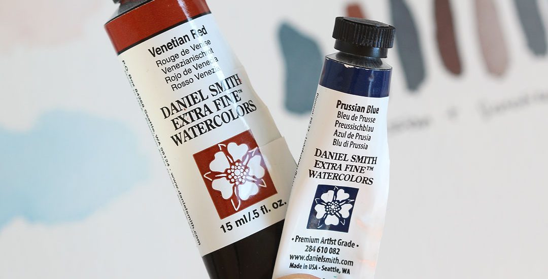
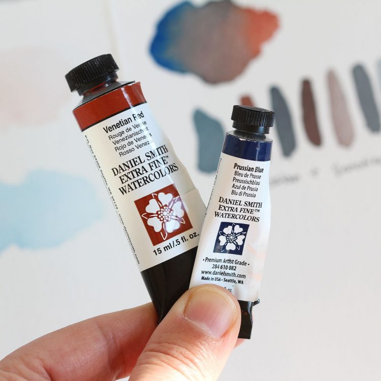
Hi all! My exploration of Prussian blue continues in this post with its mixing complement, Venetian Red!
What is a mixing complement you ask? According to handprint.com:
Subtractive complementary colors or mixing complements are two paints, from roughly opposite sides of the color wheel, that can mix to make a pure gray or achromatic color. These paint pairs are invaluable for mixing dark neutrals, and as signposts to color design decisions.
You’re going to want to bookmark that page on handprint.com as there’s a handy chart with a color and it’s mixing complement. I use it all the time! I’ve gotten in the habit of looking up a color’s mixing complement whenever I’m first learning about it — it’s really helped me understand both the color itself and has helped my mixing game.
Here’s my sketchbook to see this in action. On the left side I swatched out the pure colors, and then on the right I’ve mixed them together:
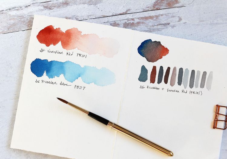
Look at all those beautiful variations — it’s easy to make a cool gray vs a warm gray just by varying the amount of Prussian Blue or Venetian red.
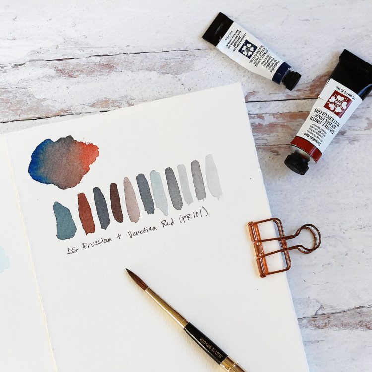
Don’t forget to add water to lighten them, too.
All this from just two colors! That’s the magic of watercolor.
Now you may be asking yourself well what is this used for? So many things! Any time the pure color is too vivid you can tone it down a bit with its mixing complement.
Here’s a quick list with an imaginary scene:
- Say you’re painting a stormy sky with Prussian blue and you want to add some gray clouds in there — just add some Venetian red!
- Now suppose there’s a mighty redwood tree in your landscape under that sky. Venetian red is perfect for the trunk, and mixing in a little Prussian Blue will let you add shading.
- Now suppose there’s a squirrel up in the tree — mix Prussian blue and Venetian red together for the perfect gray.
Hope that gives you some ideas!
Supplies
Note that these are my affiliate links so if you make a purchase by clicking the link below I’ll receive a small commission at no charge to you — thank you!


I’ll be back with a little painting using these two from a rainy day scene at a pond in our neighborhood — so stay tuned!
Thanks for this in depth look at these complementary colors. As a beginner at coloring (in any medium, I used to avoid coloring stamped images) I appreciate all this helpful info – I wouldn’t intuitively think to use Venetian red to help paint dark clouds to the stormy sky, so much to learn! Thank you again.