
Hi all! I’ve had so many questions about what paints and palette for watercolors I use so I thought I’d do a post — so here we are! :)
- I use tube paints from various manufacturers or paints that I made myself and put them in pans. More on the specific paints below.
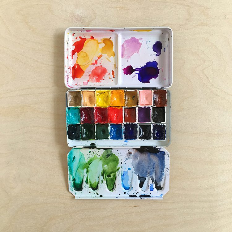
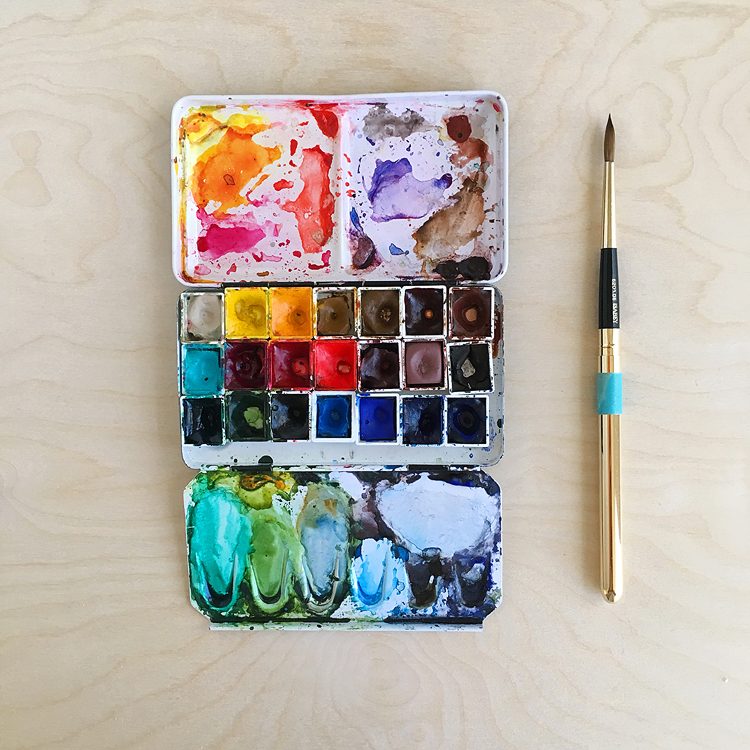
- I use this small metal palette box from Case For Making, similar ones here from Blue Rooster and here from Amazon. I like this palette from Case For Making because it’s easy to take with me and the lid that flap that flips out with the mixing wells sits on the work surface and it has 6 wells on that side for plenty of mixing areas. I don’t like palettes with flaps that stick out in the air ha! I’ve had this little palette for about 3 years now and it’s been everywhere with me, so I’d say it’s pretty durable. From looking at the photos, I’d guess that the Blue Rooster one is the most similar. If anyone can confirm I’d love to hear.
- I took out the removable tray so that I could fit more colors in and I use these little 3 mm magnets to hold the pans in the corners where the bumps are and this magnetic tape for the rest. I tried using that blue tack stuff but I kept having problems with pans falling out when we’d get up in the 100 degree Texas heat! :-D
- I get the pans from Kremer and Blue Rooster. One note — the pans that come with the Meeden palettes have thick walls that bug me hahaha! And I don’t like the translucent ones. So I prefer to get my pans separately from Kremer or Blue Rooster.
- I write the names and makers on the left sides of the pans with a sharpie so that I know what’s what.
Full disclosure: I wanted to mention that I do have this BIG palette but I keep it in a drawer haha! It takes up too much room on my desk and I had trouble remembering what the colors were without checking the side of the pan and I didn’t remember the properties — is that color granulating? Staining? I just couldn’t keep it all in mind and it really interrupted my flow. With this small palette I can keep everything in my brain and I’ve gotten so used to it that I can paint with it out in the field at dusk or on long flights when the cabin lights are dim. I now use the big guy for storing filled pans that are out of rotation in my main palette.
I love being able to grab this palette and toss it in a bag to take with me — I take it on short hikes or on trips all the time and since it’s the one that I use at my desk it’s always ready to roll. I also have some small but mighty palettes that I’ll post about soon!
Okay so now on to the paints! I chose these colors for what I paint the most, which is mostly Texas wildflowers and landscapes. Although Texas is a big state this palette does the trick, from here in Central Texas to the desert and mountains of West Texas, the prairies and all the way out to the coast.
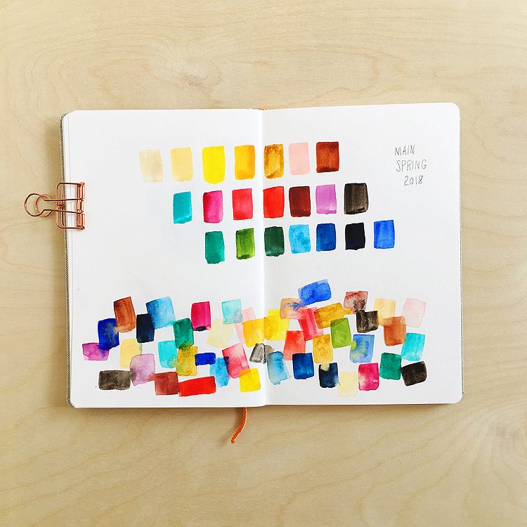
Here are some little swatches so you can see how they paint out:
Abbreviations for manufacturers:
- S = made by me! :)
- WN = Winsor & Newton Professional – I started out with WN but have been gradually moving to DS as a color runs out as I find DS colors rewet easier; sometimes WN would crack in in the pans, grrrr
- MG = M. Graham – I have 3 colors of these, so far they haven’t really worked for me but I do love the colors! They just don’t seem to want to set up, even after sitting in the pans for weeks :(
- DS – Daniel Smith – my new gold standard
- DV = DaVinci — I’ve been exploring these a little after hearing good things about how well they rewet and love them so far
- H = Holbein
I added purchasing links to these where possible: AZ = Amazon and and EH = Ellen Hutson. These are referral links so if you make a purchase by clicking the link I’ll receive a small commission at no charge to you — thank you!
Top row:
- (S) French ochre extra light – aka foexl — I made this paint from pigment that I got from Kremer Pigments. Buff Titanium from Daniel Smith used to occupy this spot but I didn’t like how hard it was to rewet and it was kind of dull. I usually use this mixed with other colors, except when painting limestone. (I learned how to make paint at a workshop at Case For Making in San Francisco — it’s so cool to use paints you’ve made yourself! If ever you have a chance to take a workshop there you should totally do it!)
- (DS) Naples yellow – an opaque, peachy yellow. I especially like this one mixed with cascade green and quinacridone coral [AZ, EH]
- (DS) Hansa yellow medium – aka hym — it leans a bit warm but I haven’t found a cool yellow that I like yet, they always seem to fade on me. Maybe it’s the Texas heat thing again! [AZ, EH]
- (DS) New Gamboge — this color can easily be mixed with hym and pyroll scarlet but we have so many wildflowers in this color in all seasons that it’s really handy to have [AZ, EH]
- (DS) Monte amiata natural sienna — this one is great for using in skies as it doesn’t turn as green the way that HYM does [AZ, EH]
- (H) Shell pink – this is an opaque, light peachy pink — love it for deserts and wildflowers [AZ]
- (DV) Burnt Sienna – this gets used all the time; I switched this one to DaVinci and love how it rewets
Second row:
- (WN) Cobalt teal light — love this color! It’s great mixing it with naples yellow and foexl for agaves and yuccas
- (DS) Quinacridone rose – cool red — this is my “standard” red [AZ]
- (DS) Quinacridone coral – warm red. Note that this color goes on strong but fades as it dries. We have so many wildflowers that are this color so it’s handy to have. Plus I just love this color for sunrises/sunsets. [AZ, EH]
- (DS) Pyroll scarlet – super saturated warm red! The color of hummingbird flowers [AZ, EH]
- (WN) Indian red – opaque red, it’s great for West Texas rocks
- (S) Ultramarine red dark pink – another one I made from pigment from Kremer. This is the first palette that I’ve put a purple in, they’re so easy to mix but I found myself mixing them all the time so this is a shortcut
- (S) Cassel earth – I made this dark brown from pigment from Rublev Colours. I love the dark, smokey color and use it instead of an umber as I found those too weak
Third row:
- (DS) Phthalo green, blue shade – this obnoxious green is a great starting point for cacti and agave, but I don’t use it on it’s own [AZ, EH]
- (DS) Sap green – this is my go-to convenience green [AZ, EH]
- (DS) Cascade green – another one that can be easily mixed but it has such fun granulation — great for rows of distant junipers [EH]
- (DS) Manganese blue hue – I’ve been playing around with this for skies. I used to use the WN version but it dried so hard in the pan and was hard to get it going in the field so I switched to DS. Still not too sure about it, it’s kind of weak and you have to really work to get the paint activated, but it’s super easy to lift out clouds with a tissue. So we’ll see if this stays in the next palette update…! [AZ, EH]
- (DS) Phthalo blue, green shade – another phthalo that I rarely use straight up! [AZ, EH]
- (WN) Indigo – I use this instead of black — love how it’s so dark and rich and moody
- (DV) Ultramarine blue – my standard blue [AZ]
I also have 2 blobs of burnt sienna and ultramarine blue down in the mixing areas so that I can quickly mix up a gray or use them for adding to other mixes.
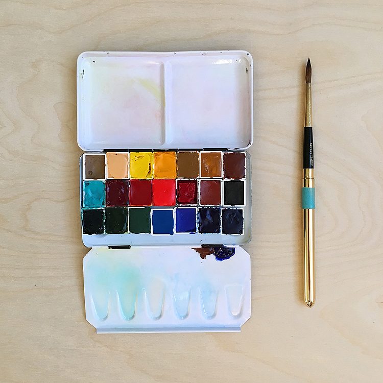
When colors get used up I refresh the pans by squeezing out more color from the tubes. Every once in while I’ll give the palette a good cleaning — I’ve found that magic erasers are great for removing some of the stains — but that darn phthalo blue doesn’t budge. It’s so pretty tho it’s a keeper. Have to add that the magic eraser also helps prep new palettes so that paint doesn’t bead up on them.
Here’s a before photo from when I cleaned up my palette in January before going on a month long road trip:
Wanted to add a bit about the mixing areas:
- Upper right is used for pinks/reds/yellows
- Upper left is for purples/browns
- First 3 on the bottom row are for greens — agave/cactus greens, sap green base, and cool blueish greens
- The next 3 on the bottom are for blues and grays
And here she is, all pretty and ready for new adventures:
Those two blobs down in the mixing area are burnt sienna and ultramarine blue. I mix those two together by running my brush back and forth over them and I let them run down the side into the little mixing well. Sometimes if I remember I put a blob of hyl in my green mixing area but I forgot this time.
One more thing before I go — when I started getting serious about watercolor I did a ton of research, and these artists really helped me and influenced my own choices:
- Jane Blundell – her ultimate mixing palette rocks. I got her ebook and worked my way through it, it was so helpful. She also has more palette lists on her blog.
- Liz Steel – love how her palette has both full and half pans — I don’t know why I never thought of that! Also love her article about putting together a palette for a big trip here.
- John Muir Laws – he has so many great tips for nature sketching — info on his palette and more here
- Handprint by Bruce MacEvoy — he has so much good info! Seriously good. Before purchasing a new color I always check his site first.
Hope this helps someone out there!
Please let me know if you have any questions,
[…] Main Palette […]
[…] Main Palette […]
[…] Main Palette […]