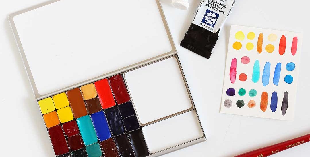
I just finished filling my new Folio palette from Art Toolkit and I thought I’d list all the colors here so you could see them.
Full disclosure: I’m an ambassador for Art Toolkit and I was sent this palette for free — however, I’d have purchased it myself without question — I’ve wanted a palette like this for years!
I can’t tell you how much I love all those mixing areas! I plan to use the biggest mixing pan for skies, the smaller one for greens, and the mixing area on the lid for everything else. Here in Texas where I paint things dry super fast, so it will be so great having plenty of room for mixing big puddles of color.
I’m thinking of this as my “curious color exploration palette” — it has some tried and true favorites plus some colors that are new to me. This palette also has one color that I blended myself from commercial paints — more about that below.
A note about the pans: the mini pans are 1/8th of a regular “half pan” and the larger ones are called “standard” pans and are a 1/4th the size of a regular “half pan”. As I work with this palette I may upgrade some of the minis to standard pans and take out others — that’s the fun of exploring color.
Now meet the colors, starting from top left and going across by the standard pans in the row. Note: I’ve listed all the colors using the Daniel Smith names when possible, although I have a mix of brands here. I noted the pigment numbers as I’ve learned to always go by them instead of the color name as it varies between brands. (Don’t ask me how many tubes of PR209 I have! lol!)
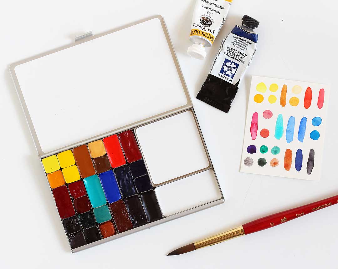
First row:
- Hansa yellow light (PY3)
- New Gamboge (P797, PY110)
- Two mini pans of Hansa yellow medium (PY74) — one to keep clean and one to use for mixing — I saw this on the Art Toolkit instagram feed and had to give it a try!
- Raw sienna (PBr7) (I might switch back to yellow ochre here, we’ll see!)
- Naples yellow (PW4, PY97, PR101)
- Quinacridone gold (PO48, PY150)
- Cadmium red light (PR108) (this one is DaVinci, it’s similar to DS Cadmium red scarlet hue)
- Quinacridone coral (PR209)
Second row:
- Quinacridone rose (PV19)
- Permanent alizarin crimson (PR177, PV19, PR149) — so many books refer to alizarin crimson so I had to see what it was all about!
- Deep scarlet (PR175)
- Cerulean blue chromium (this is PB36, cobalt turquoise by DaVinci Paint. It behaves differently than the DS version so I thought I’d call that out to you)
- Cobalt blue (PB28)
- Ultramarine blue (PB29)
- Phthalo blue (red shade)
- Phthalo blue (green shade) — I put both of these in my palette so I could decide which I prefer once and for all :)
Third row:
- Carbazole violet (PV23)
- Bloodstone genuine
- Phthalo green (blue shade) (PG7)
- Perylene green ( PBk31)
- Desert green, that I mixed using cobalt green (PG50), cobalt teal blue (PG50), Chinese white (PW4, PW6), Potter’s Pink (PR233) and a tiny bit of phthalo blue green shade (PB15). Yep, I broke all the mixing rules here!
- Lunar earth (PBr11)
- Transparent red oxide (PR101)
- Indanthrone blue (PB60)
- Neutral tint (PBk6, PV19, PB15)
Here’s a closer look at the super granulating desert green I mixed:
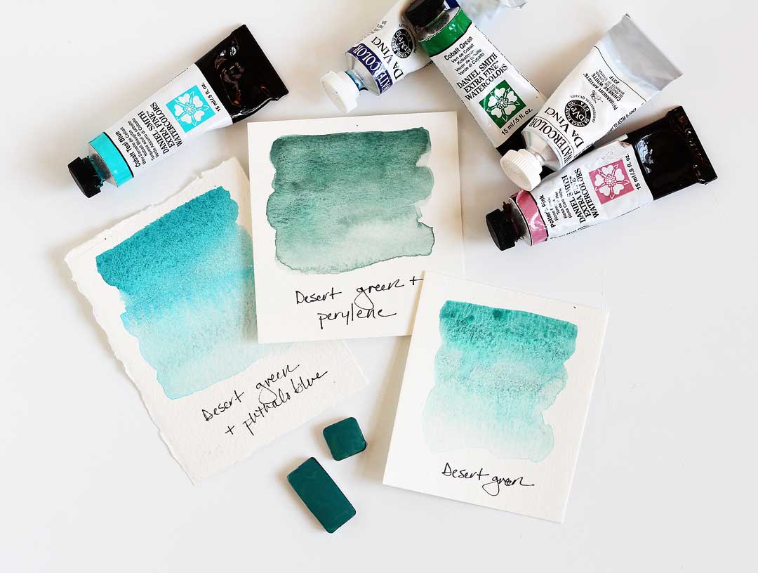
I was inspired by DS undersea green, but here I was going for the color of cacti, agaves and yuccas — it’s so hard to mix in the field! To make the custom blend I squeezed some paints from the tubes on a plate and then used a palette knife to mix them together. It looks great mixed with perylene green and a little more phthalo blue, too.
Let me know if you have any questions! — Lisa
Supplies
Note that these are my affiliate links so if you make a purchase by clicking the link below I’ll receive a small commission at no charge to you — thank you!


