I’ve been teaching some in person classes lately and people have been asking for suggestions on good watercolor starter sets. Sets that don’t break the bank but are still artist quality. Well, look no further than the QoR Intro set of 6.
As I’m writing this it’s $22.68 on Amazon! That’s a serious steal in my book!
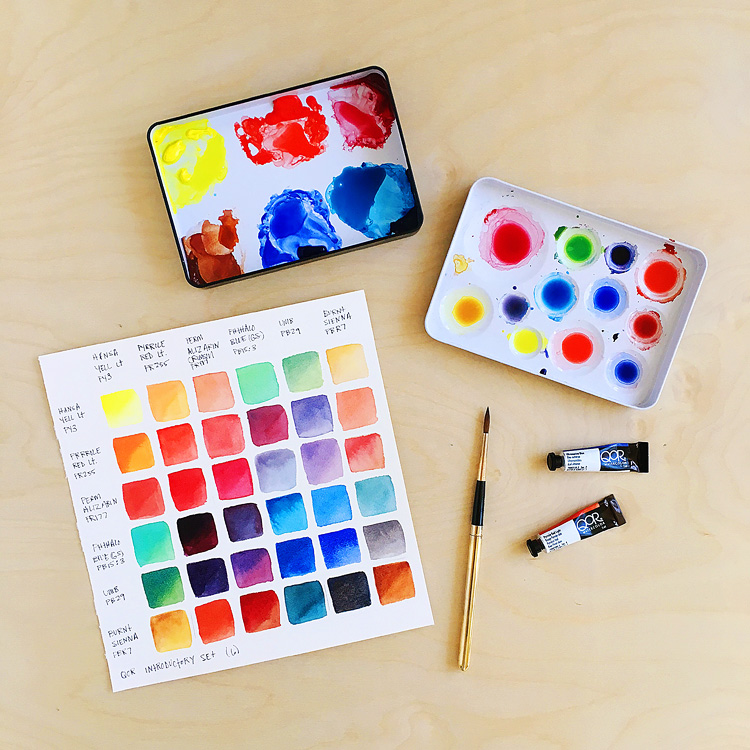
It comes as a set of 6 tubes — you can squeeze the paint out into pans, on a plate, or even in the handy metal tin that the tubes come in. The lid has little mixing wells built right in — I wish more manufacturers thought of things like this! I plan on putting the lid in my backpack — I’ve tried using lids from takeout containers before but they blow away in the wind hahaha. This will rock!
The surface is white enamel and seems to be non-staining — even phthalo blue doesn’t phase it.
The 6 colors include:
- Hansa yellow light (PY3): a very pale, cool yellow; think lemons and sunlight through trees. I love the mint green that you get when mixing it with phthalo blue.
- Pyrrole red light (PR255): a warm red; mix with Hansa yellow light for a beautiful orange. Great for florals!
- Permanent alizarin crimson (PR177): a cool red; I’ve never been much of a fan of this old-school color but this one by QoR is growing on me! Mix it with pyrrole red light for a true primary red.
- Phthalo blue (green shade) (PB15:3): a vibrant, cool blue; a little bit of this goes a long way! Mixing it with the pyrrol scarlet will give you a super dark gray/black. Add more pyrrol scarlet for a deep rich brown. This is a very staining blue, but if you act fast you can still do the trick where you lift some with a tissue to make clouds.
- Ultramarine blue (PB29): a granulating, warm blue — this is the best commercially made ultramarine blue I’ve ever used, hands-down! Serious love for this color.
- Burnt sienna (PBr7): a granulating, warm brown — mix this with ultramarine for a dark grayish black. I love it that this starter set includes burnt sienna as I use this combo often.
Here’s a scan of the chart so you can see it better:
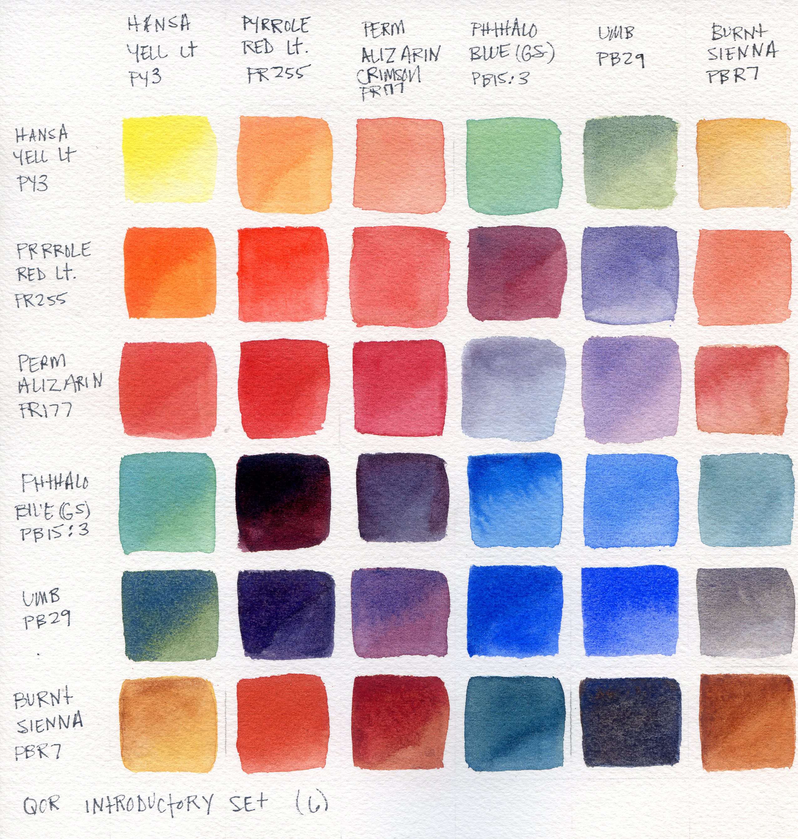
I used Arches cold press paper for my chart, and you can see the texture of the paper in the scan. I tried to paint each square so that it was darker at the top left and then faded as it went down, but that didn’t always work out ha!
The colors on the diagonal are the pure colors, without being mixed with others. To paint each square I loaded up my brush with color, then dipped it in clean water, tapped a little of the water off and painted the whole square. Then I loaded my brush up again with pure color and dotted it in the top left corner and let it blend.
If you’d rather start off with more colors, I highly recommend the QoR Intro set of 12. This set comes in the same tin as the set of 6, and it includes those 6 colors plus 6 more including:
- Quinacridone magenta (PR122) – a beautiful cool pink; great for florals. It makes great purples mixed with either of the blues. I always have this or PV19 on my palette, I’ve gotten used to using it as my primary “red”.
- Viridian green (PG18) – this is the best viridian I’ve ever used, hands down. Other brands that I’ve used are weakly tinting and hard to rewet, but not this one!
- Paynes gray (PB15:3, PBk7, PV19) – a deep blue/gray that can go to black at full strength; great for doing value studies.
- Yellow Ochre (Py43) – great for mixing greens with either of the blues or the viridian and for skies.
- Nickel Azo Yellow (PY150) – a beautiful clear yellow.
- Quinacridone Gold Deep (PO48) – I haven’t played with this color much yet, but I can tell you it’s a beautiful orange.
One more note about QoR colors before I go! QoR uses the same artist pigments as other high quality watercolors such as Daniel Smith, Winsor and Newton, DaVinci, etc. However, unlike those brands that use a traditional solution of gum arabic, a resin that comes from acacia trees in their binding medium, QoR uses aquazol, which is a synthetic binder. I first tried QoR colors just for this reason as I was having problems with traditionally made paints misbehaving in our 100 degree Texas heat. So far the QoR colors have held up great!
The aquazol does make bubbles in your rinse water, tho. I’ve also noticed that the colors appear super bright when you first apply them, then lighten as they dry. I have compared colors of ultramarine blue and phthalo blue that I have in other brands and they are the same when dry. Just something to be aware of. I have to say that they rewet like a dream — even that viridian!
Speaking of Daniel Smith, find my writeup on their introductory set here in this post.
Links
Here are the links to both of the QoR sets mentioned on Amazon (note, these are my referral links, so I’ll receive a small commission if you make a purchase by clicking the link. Thank you so much for your support.)
- QoR Intro set of 12
- QoR Intro set of 6
- Arches French Bound Cold Press Watercolor Paper Pad 9×12 — even if you’re just starting out, I highly recommend this paper. Find it on Amazon or Ellen Hutson
Please let me know if you have any questions, and happy painting!
QoR and Lisa love! You did it! I love color mixing and some of the results I wouldn’t have guessed – like (left vertical) Phthlo Blue with (top horizontal) Pyrolle Red Lt or with Perm Aliz Alin Crimson. Or Burnt Sienna with UMB. Others too.
I have a larger set of QoR I was lucky enough to get at a great price (LSS with deep discounts) and think it would take forever to make a chart but maybe someday when I have 100 hours…
Thank you, Lisa!
[…] sets – the QoR intro set of 6 colors is hard to beat — read my full review here. The 6 tube colors come in a metal tin that can double as a palette — the lid even has mixing […]
[…] sets – the QoR intro set of 6 colors is hard to beat — read my full review here. The 6 tube colors come in a metal tin that can double as a palette — the lid even has mixing […]