Hello all you fab-BOO-lous people out there! If you’re a lover of all things fall and Halloween like me then the Ellen Hutson Fall release is for you — see it all right HERE! I thought I’d share a few of the cards I’ve made — so far — I’ve got more in the works, too!
A Boo-quet of Halloween Wishes
The new Halloween Boo-quet set totally cracked me y’all!
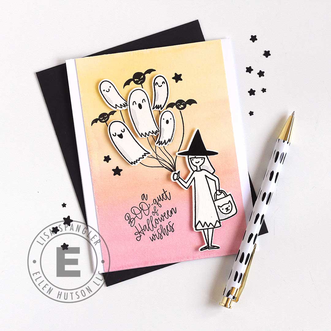
I wanted to let those stamps shine, so I made a gradient background with watercolors and then just added a little shading here and there.
Tips and Tricks:
- Tape your watercolor paper down on a board to keep it from warping — but if you forget you can always flatten it later! Just let it dry completely, then wet the back, put it under one of the plates from your die cut machine and put some heavy books on top and let it dry for a few hours.
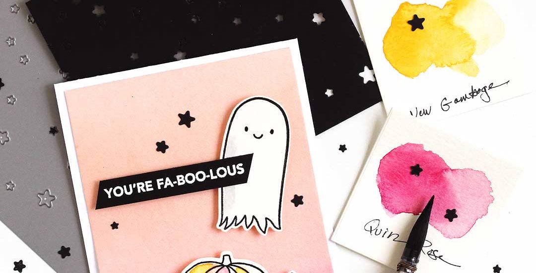
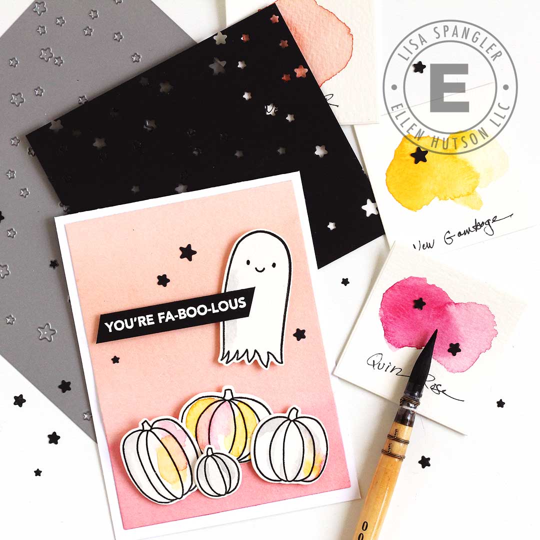
- To get that gradient I first mixed up juicy puddles of new gamboge (yellow) and quinacridone rose (pink) — I can’t stop using these two for fall!
- Then I wet the paper all over with clean water, and brushed on new gamboge at the top and quinacridone rose at the bottom, then let them mingle together. Use a BIG brush, go fast, and don’t overwork an area that you’ve already painted. Both of these colors are found in the Daniel Smith Essentials set.
- To mix the gray, I mixed leftover paint from the gradient and added a touch of French ultramarine, also in the DS Essentials set!
- Those starry “sequins” are leftovers from when I used the Starry Night die — love that it’s a background and sequin maker all in one!
Now for some tags!
Tags, tags, tags!
I can’t wait to turn these Farmhouse Tags into cards or tie ’em on packages!
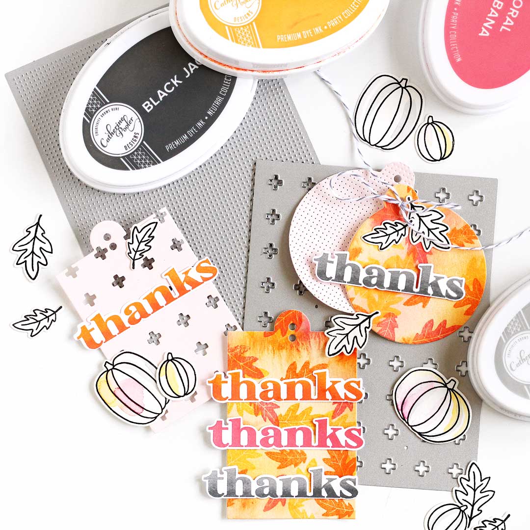
These tags feature the new Pumpkin Season set — it’s got sentiments as well as those pumpkin and leafy images — so fun!
Tips and Tricks:
- For high contrast, use the solid leaves and the uncolored outline leaves both standalone.
- For the leafy backgrounds, I first watercolored some scraps of watercolor paper and then after it had dried I stamped over top — then I gave it a light mist with water to let the colors all run together — love the soft focus this gives!
- To get the gradient on the “thanks”, I inked it in the lightest color first and then cleaned the stamp, then tapped the bottom edge with the darker color. I tapped a dry rag along the upper portion of the letters to make sure I got most of that darker color off, then stamped away!
- The Nordic Cross and A2 Piercing Plate 2 cover dies both add so much texture!
Last but not least, my fave card of the release — so far!
You’re Fab-boo-lous!
This is another clean and simple card to keep the focus on that ghost from Halloween Treat Tags — love that sweet face!
Tips and Tricks:
- For this background, I mixed up a big juicy puddle of new gamboge (yellow) and quinacridone rose (pink) — there’s those two colors again — and added plenty of water to make a peachy coral — love how modern this color is for Halloween!
- To get a smooth gradient, paint all over with the mixed coral color and let it dry.
- After it’s completely dry, go back and add more paint to the bottom, fading it with clean water in the middle.
- Tilt your board so that most of the pigment particles settle down at the bottom.
- To prevent dreaded backruns, use a rag or paper towel to sop up extra color along the tape.
I could just sit and color backgrounds all day!
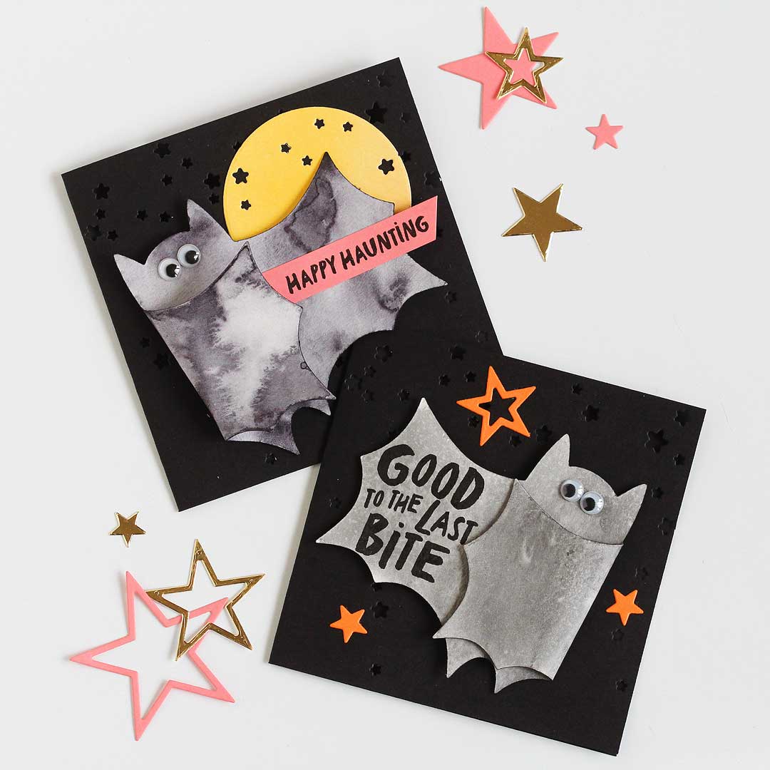
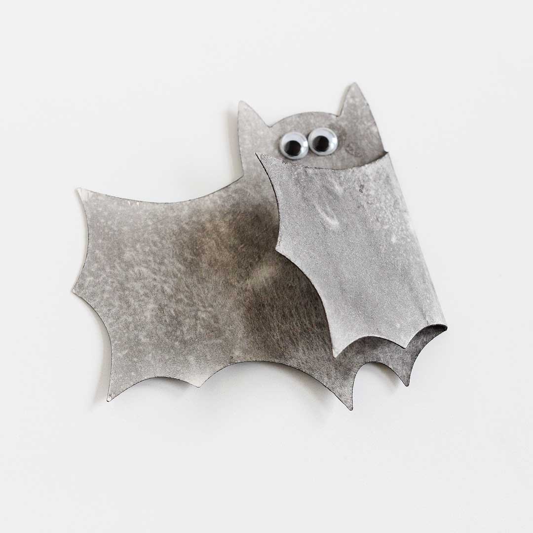
Bat Hugger
I’m totally batty for the new Bat Hugger Die! So fun! I wanted to watercolor him and decided to play around with neutral tint and graphite, both by Daniel Smith!
Neutral Tint
First off, DS neutral tint. This color has a super fun property — it’s very active wet on wet and blooms easily, so you can get some really amazing effects!
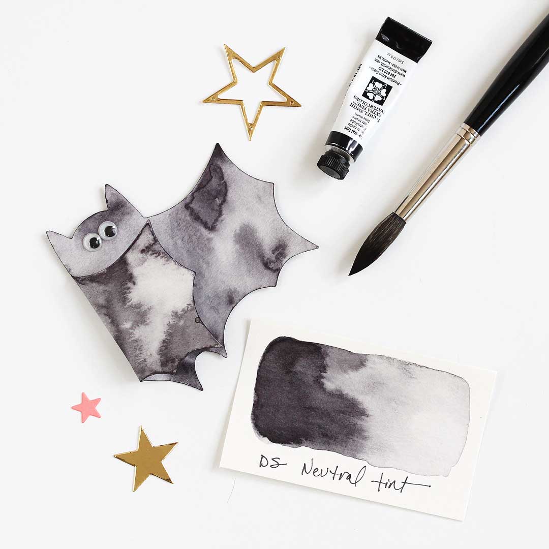
Just brush on neutral tint and let it soak into the paper for a bit — the time will vary depending on temperature and humidity, so you can always paint a swatch to check it.
Then load your brush with clean water — or more neutral tint — and drop it in and watch the paint move around! SO mesmerizing!
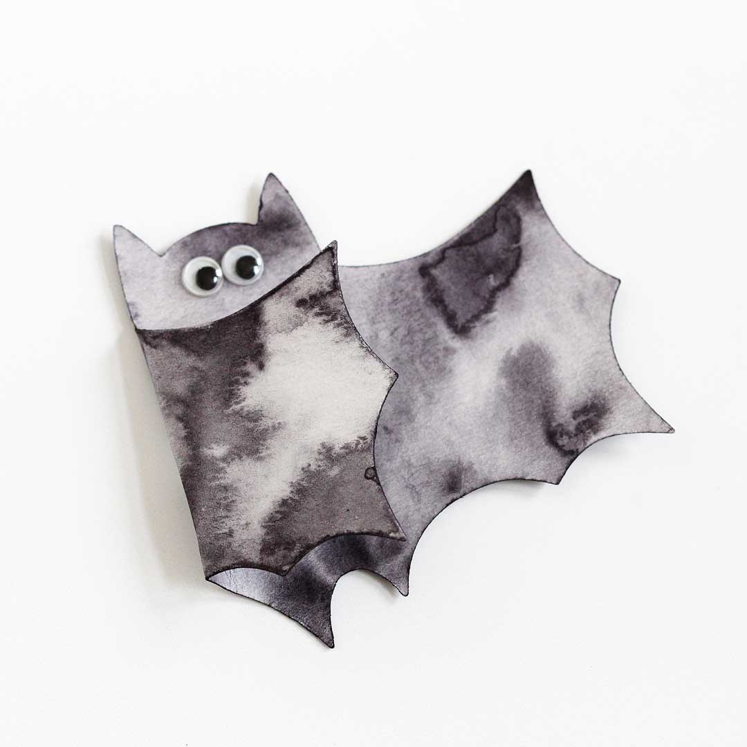
Just look at that cool texture! It’s never the same twice.
Graphite Gray
Next up, Daniel Smith graphite gray! This is another fun color to play with wet on wet, although it’s more subtle than neutral tint.
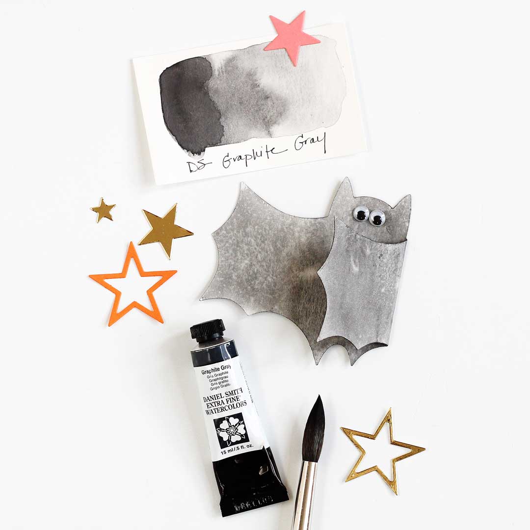
Graphite gray has a really subtle shimmer to it — like a graphite pencil — that’s really hard to capture in a photo!
So which is your fave? Graphite grey or neutral tint? :)
Oh and one last tip! I don’t have a hot foil machine, so I turned to the trusty Starry Night die for those card backgrounds — but shiny gold stars using the new Tiny Stars Background would be super cute here!
That’s it for my projects for now — stay tuned for more! :)
Supplies
Note that these are my affiliate links so if you make a purchase by clicking the link below I’ll receive a small commission at no charge to you — thank you!
>>> Shop the full Fall Release right HERE! <<<


And here are the oldies but goodies!


Giveaway!
There’s a scary-good giveaway over on instagram — be sure to head on over there and enter! Up for grabs are THREE $25 gift certificates to the Ellen Hutson shop! Yay!
Happy fall, y’all! — Lisa