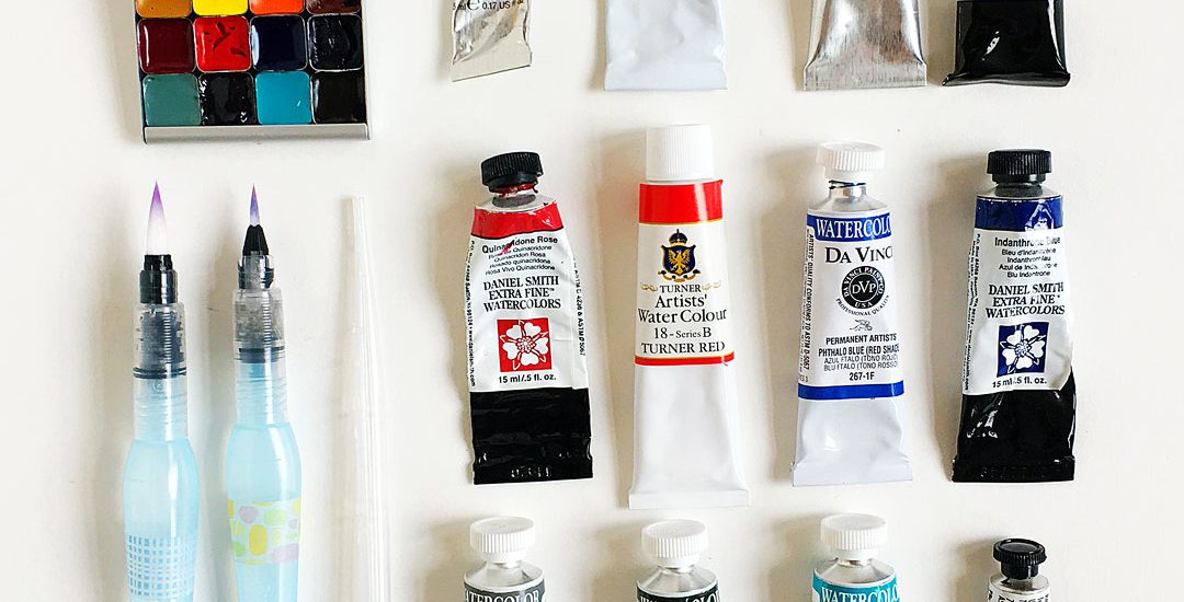
I just finished setting up my backpacking palette and thought I’d share it here in case it helps someone — this is the tiniest palette ever and I can’t wait to take it on adventures.
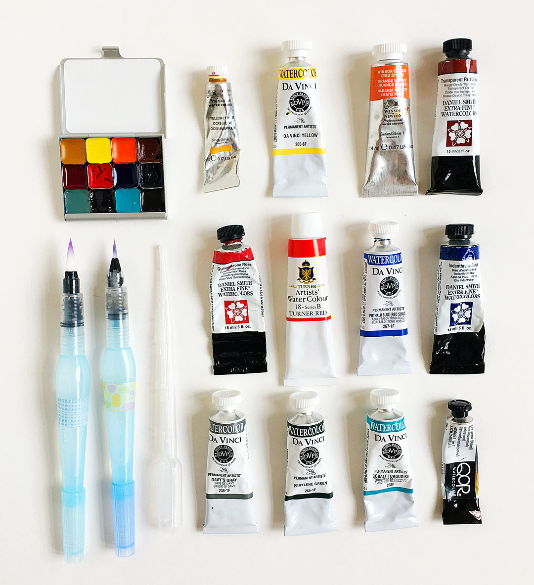
This little gem is the demi palette from Expeditionary Arts. It holds 12 colors, here they are plus the brands from top left:
- First row: WN yellow ochre (PY43), Da Vinci Yellow (PY154), Winsor Orange (RS) (PO73) , DS transparent red oxide (PR101)
- Second row: DS quinacridone rose (PV19), Turner red (PR188), DV phthalo blue (RS) (PB15), DS indanthrone blue (PB60)
- Third row: DV Davy’s gray (PW6, PBk6, PG7), DV perylene green (PBk31), DV cobalt turquoise (PB36), QoR raw umber (PBr7)
I’ll be bringing along these two water brushes and a little mixing tray.
Here’s a bit about each color and my thought process in case it helps you — I worked on this for almost a week, so hard to narrow things down!
- I’m going backpacking in Big Bend National Park — it’s an awe inspiring mix of desert, mountains and river — and I wanted this palette to be able to handle them all. I paint mostly botanicals and landscapes so it was important to be able to to
- As you can see I’m not a brand specific kind of gal. I listed the pigment numbers for you as I’ve learned to always go by the number and not the color name.
- I always have a quinacridone rose, a phthalo blue, transparent red oxide, yellow ochre or sienna, primary yellow on all of my palettes
Now for a bit about each color:
- yellow ochre — this is great for sunsets and deserts alike; I have this or DS Monte Amiata Sienna in all my palettes
- PY154 is a bright, clear yellow. I used to use Hansa yellow medium but switched over to this last year because I like how it handles better.
- Winsor Orange red shade is a vibrant clear orange that’s the prefect color for some of the mountain wildflowers; it’s also great for rocks; haven’t found another brand to compare
- Transparent red oxide (PR101) – love mixing this with indanthrone blue for moody skies; it also makes some neat purples
- DS quinacridone rose — this is the coolest PV19 I’ve worked with
- Turner red — I picked this color up recently as I love Turner’s brilliant red in their gouache so I wanted to give their watercolor a try! I’m doing a lightfast test on it and may end up swapping it out for Winsor Red (PR254) if it doesn’t hold up. It cracked a little while drying but it still seems to rewet fine. We’ll see!
- Phthalo blue red shade — this color is pretty similar across brands; I plan to use it for clear blue skies. I’m not a fan of granulation in my skies unless it’s a stormy one!
- Indanthrone blue — I plan to use this for dusky skies, purples and more.
- Davy’s gray is the perfect shade for agaves and yuccas — it’s so hard to mix in the field.
- Perylene green is great for the deep green of pines and can also be mixed with Davy’s gray for darker agave grays.
- Cobalt turquoise is another one to mix with Davy’s gray for yuccas and agaves; it also mixes with quinacridone rose for a beautiful granulating turquoise and phthalo blue for cooler skies.
- Last but not least, raw umber — I specifically picked the QoR version here as it rewets so well. It’s a useful color for toning other colors down/darkening them.
Let me know if you have any questions and I’ll be happy to answer them!