Any other color nerds out there geeking out about the Pantone color of the year, Classic Blue? I sure am! Be sure to check out my friend Sandy Allnock’s post over here on the Ellen Hutson blog and find out allllll about it, where she matches this color in 8 mediums.
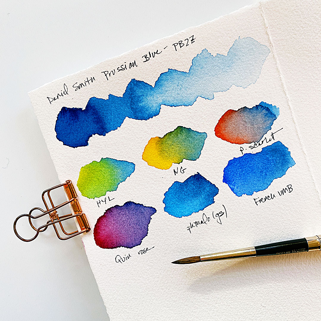
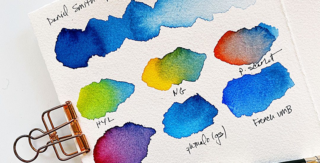
For watercolor the closest match is Prussian blue — and I just happen to have this color in my stash from when I was on a quest for mixing pine greens — so I had to bust it out and do some quick swatches of it with the Daniel Smith Essentials set. Oh yeah, just HAD to be done!
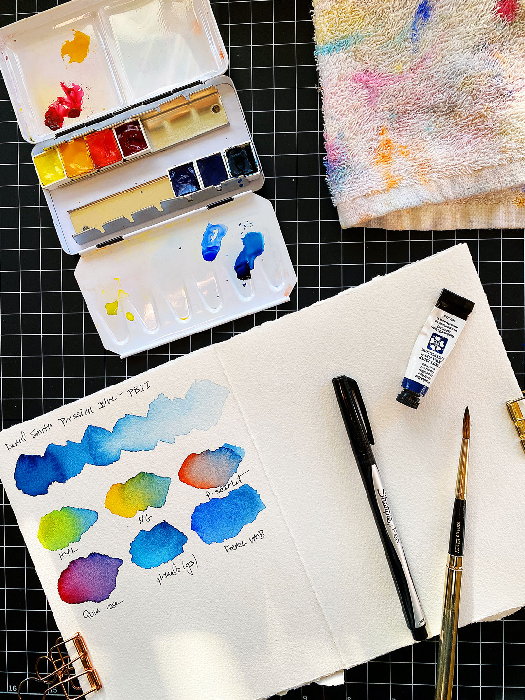
Why the Essentials set, you might ask? Well, that’s because I’ve spent a long time learning these 6 colors, so I learn more by using them instead of colors at random. Find out more about the Essentials set in THIS post. It really is essential!
I’m not one for formal swatches or anything like that — don’t have the patience for it lol! It’s more fun to just put the colors next to each other and watch them do their thing.
Find a video of the swatches HERE in my instagram stories — I added it as a highlight for ya so you can easily find it! It’s kinda mesmerizing watching the colors move.
First impressions:
- Prussian blue will bloom easily when a juicier color is painted next to it — which can be really cool or it can mess up your project. Just something to keep in mind.
- It’ll make a bright spring green with Hansa yellow light or a muted olive-y green with new gamboge.
- The purple you get with quinacridone rose is amazing! Better than any purple you can get from a tube, hands-down.
- Last but not least, when mixed with pyrrol scarlet you come close to gray. Not exactly the mixing complement tho — more on that in the next few days…
Stay tuned!
Supplies
Note that these are my affiliate links so if you make a purchase by clicking the link below I’ll receive a small commission at no charge to you — thank you!


