I’ve been getting several questions from you all asking me about recommendations for a good set of watercolors to get started with — so I’m working on a series of posts for you, starting with the Daniel Smith Essentials set of 6 (Find it on Amazon or Ellen Hutson):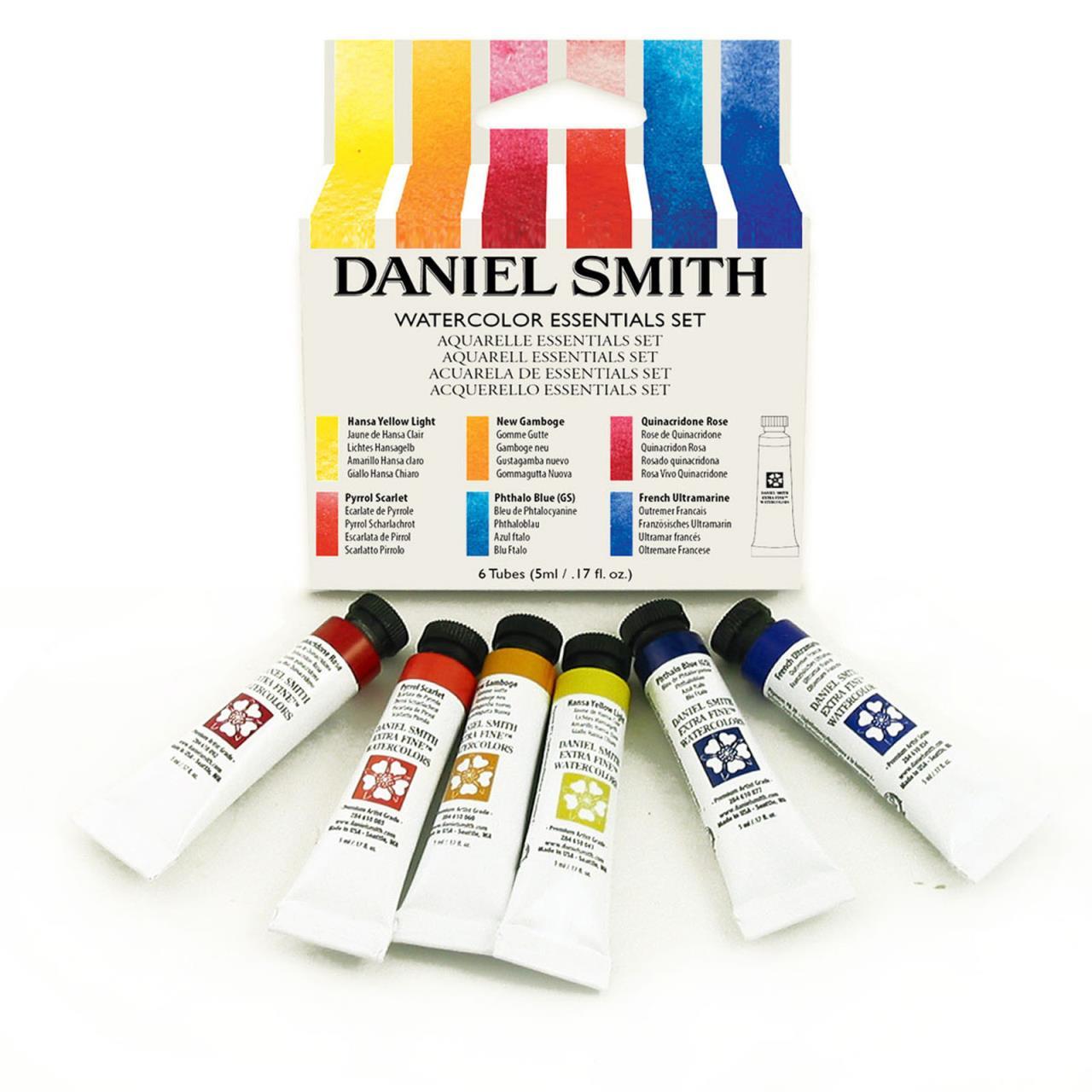
I got my set 2 years ago for Christmas and I learned so much by using it. Such rich, vibrant colors!
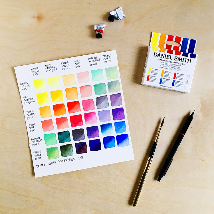
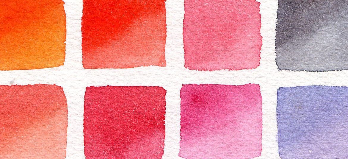
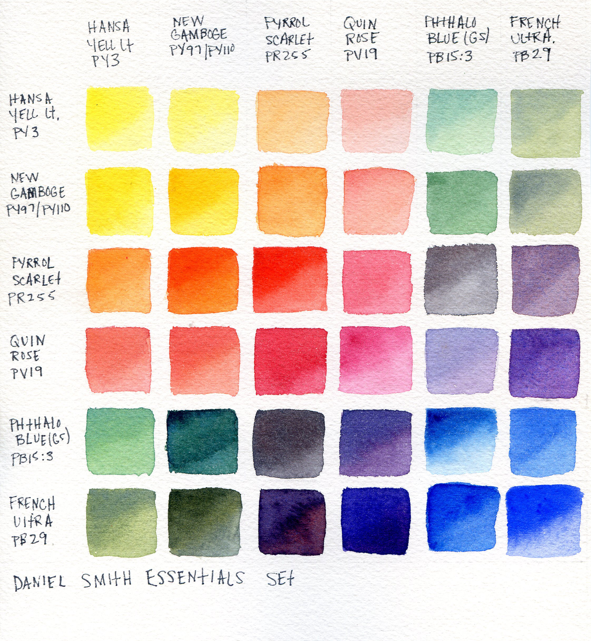
Here’s a color chart with just some of the possibilities of those 6 colors — of course by adding more water or paint you can get even more variations!
It’s been cloudy and moody here today so I scanned it in so that you could see the colors better — just click to see it larger:
The scan and the photos really don’t do these colors justice! You’ve gotta see them in real life.
I used Arches cold press paper for my chart, and you can see the texture of the paper in the scan. I tried to paint each square so that it was darker at the top left and then faded as it went down, but that didn’t always work out hahah! Some colors have a mind of their own, like the pyrrol scarlet. But that’s okay, I love them anyhow.
The colors on the diagonal are the pure colors, without being mixed with others. To paint each square I loaded up my brush with color, then dipped it in clean water, tapped a little of the water off and painted the whole square. Then I loaded my brush up again with pure color and dotted it in the top left corner and let it blend.
The squares below the diagonal are done the same way, but with the 2 corresponding colors being mixed together first. I added more water to the mix on the squares above the diagonal.
The set is made up of a warm and cool version of the 3 primary colors and comes in 5 ml tubes. You can squeeze the color out to a palette or just on a plate. Don’t worry if the colors dry — just wet them and they’ll reactivate like new. If you mix the warm cool versions of each primary together you’ll get a neutral primary. For example, phthalo blue + French ultramarine = true blue.
Here’s a quick bit on each color that’s in the set:
- Hansa Yellow Light (PY3): cool yellow, this is a very pale yellow, great for flowers, light shining through leaves, and lemons. I love the mint green that you get when mixing it with phthalo blue.
- New Gamboge (PY97 + PY110): warm yellow — another one that’s great for florals! I love the pine green you get by mixing it with phthalo blue. Look at that bright pumpkin orange you get by mixing it with pyrrol scarlet.
- Pyrrol Scarlet (PR255): warm red/orange — a little bit of this color goes a long way! Mixing it with either of the yellows makes for some pretty peach/blush tones.
- Quinacridone Rose (PV19): cool bluish red — the Daniel Smith version of this color is the bluest version I’ve ever used. The red that you get when mixing it with pyrrol scarlet is so vibrant. I haven’t found a red straight from a tube to compare.
- Phthalo blue (green shade) (PB15): cool blue — this is another one where a little goes a long way! Mixing it with the pyrrol scarlet will give you a super dark gray/black. Add more pyrrol scarlet for a deep rich brown. This is a very staining blue, but if you act fast you can still do the trick where you lift some with a tissue to make clouds.
- French Ultramarine (PB29): warm, granulating blue — this will add granulation to whatever color it’s mixed with! Mixing it with Quinacridone rose makes the prettiest purples.
I also noticed that the PrimaTek set of 6 is also part of the Gratitude sale! If you like granulating colors, this is the set for you! I think of granulating colors like jewelry or frosting — a little goes a long way.
Links
Note: These are my referral links, so I’ll receive a small commission if you make a purchase by clicking the link. Thank you so much for your support.
Daniel Smith Essentials set of 6 on Amazon or Ellen Hutson
Arches French Bound Cold Press Watercolor Paper Pad 9×12 — even if you’re just starting out, I highly recommend this paper. Find it on Amazon or Ellen Hutson
Here are some additional colors that I use all the time plus some notes about them with links to Ellen Hutson. Each color is listed in both sizes when possible.
- Hansa Yellow Medium 15ml | 5 ml — this is Hansa Yellow Light’s sister — I use this yellow a ton — it’s nice to have a true yellow on your palette without having to mix Hansa Yellow Light + New Gamboge
- Burnt Sienna 15ml | 5 ml — mix this with French Ultramarine or Ultramarine for a warm dark gray; it’s great for stormy skies and shadows
- Sap Green 15ml | 5 ml — this is my “home base” green, which I modify by adding touches of a yellow or blue, or sometimes red
- Quinacridone Coral 15ml | 5 ml — a beautiful warm red! I use it all the time for florals and sunrises/sunsets.
- Ultramarine Blue 15ml | 5 ml — Ultramarine blue is made out of the same pigment as French Ultramarine, but it’s less granulating and a little cooler in color, although it’s still a warm blue. I find it easier to use than the French version.
- Transparent Red Oxide 15ml — you don’t need both Burnt Sienna and Transparent Red Oxide (TRO) as they’re almost the same hue; TRO really reacts with water and dries a bit lighter though. Some of my palettes I keep Burnt Sienna and some have TRO but they pretty much all have one or the other! :)
Beautiful chart and reminder that we don’t need tons of colors to make tons of colors! Thank you.
I’m a little confused (so what’s new) by: “The colors on the diagonal are the pure colors.” Aren’t the pure colors the top horizontal line of boxes and the left vertical line of boxes? Thanks for any clarification about the process.
Oops – I mean the top horizontal line of color boxes – not the vertical line down. (Who’s on first!) Sorry about that.
Hi Beth! I should draw a line on the chart to explain it better but I just couldn’t bear to lol! Anyhow, the diagonal line starting from the top left square has the pure colors — so where the names meet up with themselves. For example, pure quinacridone rose is the 4th square from the left and 4th down. French ultramarine is the 6th square over from the left and in the bottom row. Hope that makes sense!
[…] Speaking of Daniel Smith, find my writeup on their introductory set here in this post. […]
[…] Smith Essentials set – read my full review here. This was my first set of “real” watercolors and I learned so much from […]
[…] Speaking of that Daniel Smith Essentials set, find a full writeup about it with a color mixing chart HERE. […]
[…] Also! If you don’t already have the Daniel Smith Essentials set now is the perfect time to take advantage of the PAPERHUGS sale and snap one up — you won’t regret it! Check out my full review of this set here. […]
[…] Smith Essentials set – read my full review here. This was my first set of “real” watercolors and I’ve learned so much from […]
[…] I used sap green for all of my stems, and added a little hansa yellow light to the right side of the stem (from the Daniel Smith Essentials set) for shading. If you don’t have these colors in your toolbox yet you totally should — find a full writeup on the set here. […]
Thank you for explaining! This year I am trying to learn different techniques and info about watercoloring. I am totally new to this and of course, would love to see videos about everything as well!
[…] I love how all the colors mingled around on here too! Once again I used the colors in the Daniel Smith Essentials set plus phthalo green — can’t get enough of that watercolor set. (Find a full review right here.) […]
[…] my full review of this set right HERE! And feast your eyes on the colors you can get with this set — and you can easily make more […]
[…] a long time learning these 6 colors, so I learn more by using them instead of colors at random. Find out more about the Essentials set in THIS post. It really is […]
[…] the way, you can find a full review of the Daniel Smith Essientials set right HERE — this set is so good you […]